Caslon By Design: The Essence of a Typeface Shapes Creative Approach
Type is designed to fit the mode of communication that a designer is utilizing. I have always had a healthy understanding and respect for the way that typography can manipulate the message of any printed page. However, I did take the opportunity to delve into the history and the essence of any typeface until I was tasked with creating a typographic poster showcasing the essence of the Caslon typeface.
Out of the eleven offered family types, Caslon drew my attention because of what little I did know about its rich history. Used in the original prints of the Declaration of Independence, and sworn by, throughout history, by some of the most famous writers, it’s no wonder that Caslon has stood the test of time. Even the drawbacks of serif typography in the digital age haven’t dampened the popularity of Caslon with its graceful serifs and highly legible letterforms.
But, the question remains, how was I going to showcase the essence of Caslon through a typographic poster? Well, first of all, I had to know the parameters in which I was to work. The final poster had to be tabloid-size (66p0 x 102p0 or 11x17 in) in either landscape or portrait direction. Also, it had to highlight a glyph, the typeface name, and a 75-word-or-less blurb that described the characteristics of Caslon.

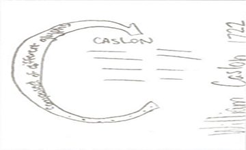
Prototype Sketch #1
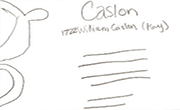
Prototype Sketch #2
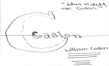
Prototype Sketch #3
The first part of the assignment was the hardest for me. Starting the rough sketches of the poster mostly blind to what the assignment would eventually entail was a challenge for me. I’ve never been great at sketching out my ideas cold. More often than not, I’ll have an idea and write it out rather than sketching it out.
While I didn’t particularly care for this stage in the ideation process, I understand its value for portraying your ideas. It helped me flesh out my ideas and start to think logically about the space available on the page. The second step of the process was to create more detailed sketches of the poster layout so that the elements could be easily copied in InDesign.
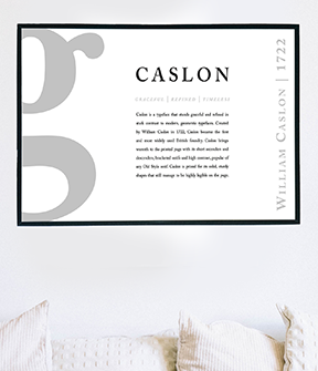
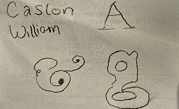
The next step was to start prototyping in InDesign. My first conceptual idea relied on displaying Caslon as body copy by using the paragraph within the letter ‘C’. My second prototype used contrast heavily to draw emphasis on the letters and numbers used, as well as highlighting body copy again with the use of the,when in doubt…, quotation. My third design used the letter ‘g’ as a huge partial glyph bleeding off of the page.
I believed that all of my prototypes had an element that was unique in their own right and wasn’t leaning towards any one of my prototypes more or less. That was until the critiquing process began. Critiques are a practice that I take very seriously because I believe that anything can be improved. Even the smallest changes in designs can lead to a huge change in the overall reception of the final product.
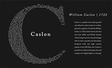
Prototype #1
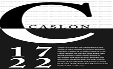
Prototype #2
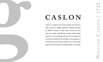
Prototype #3
My professor and classmates helped me realize that the design that exemplified the essence of the typeface, Caslon, was the third one. It was refined and graceful. Two of the words that I used to describe Caslon in my analysis. So, finally, by staying true to the essence of the typeface I was able to create an effective design that visually depicts the characteristics of Caslon.
Final Prototype:
