Analysis of Overdose Deaths and Income in North Carolina
By Anne Harris
Applied Media Analytics 15 March 2018
US National Drug Epidemic
In recent years, drug overdoses deaths have dramatically increased across the US. The CDC reports that drug overdoses now account for at least 66,000 deaths per year. Drug overdose deaths are now three times as often as they did in 1999 and are now the leading death among Americans under the age of 50 - more than either cars and guns (CDC, 2018).
For this project, I wanted to better understand the scope and effect of the drug crisis by analyzing North Carolina income and population. Therefore, I will be analyzing if there is a correlation between income and drug use in rural and urban areas based on population size with the following data. The overdose data used in this report is from the Guildford County Department of Health and Safety. Population and per capita income data was extrapolated from the North Carolina per capita income Wikipedia page.
Based on this data, I am hypothesizing that as income decreases, drug abuse and therefore overdoses will also increases. However, I also hypothesize that counties will larger populations and high overall per capita income levels will also see distinctively high levels of overdose deaths compared to high per capita income counties with lower populations.
North Carolina Per Capita Income and Population Data

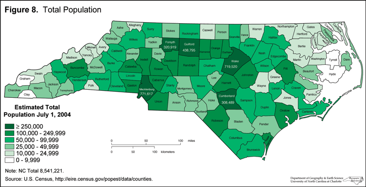
To better analyze this trend, I have plotted the population of North Carolina by county. I have also used a map detailing the population by county in North Carolina courtesy of NCPedia. I began this process by installing rvest to extrapolate per capita income data from the North Carolina wikipedia page. I used html_nodes to read the table and then set the table equal to a the variable income. From there, I cleaned the data by removing extra rows with the -c function. View the rest of my geospatial code below:
nc4 = counties(37) %>% st_as_sf() %>% rename(County = NAME) #renaming datasets
income %>% right_join(nc4) -> incomeByCounty #mergind the two datasets colnames(incomeByCounty)[3] = "per.capita.income"
gsub("[[:punct:]]","", incomeByCounty$per.capita.income) -> incomeByCounty$per.capita.income
as.numeric(incomeByCounty$per.capita.income) = incomeByCounty$per.capita.income
incomeByCounty %>% ggplot() + geom_sf(aes(fill = per.capita.income)) + theme(panel.grid.major = element_line(colour = 'transparent'), axis.title.x=element_blank(), axis.text.x=element_blank(),axis.ticks.x=element_blank(),axis.title.y=element_blank(), axis.text.y=element_blank(), axis.ticks.y=element_blank(), panel.background=element_blank(), panel.border=element_blank(),panel.grid.minor=element_blank(), plot.background=element_blank()) str(incomeByCounty$per.capita.income)
North Carolina Counties with the Largest and Smallest Populations
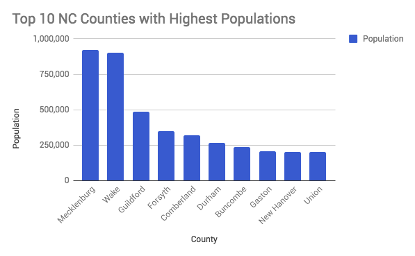
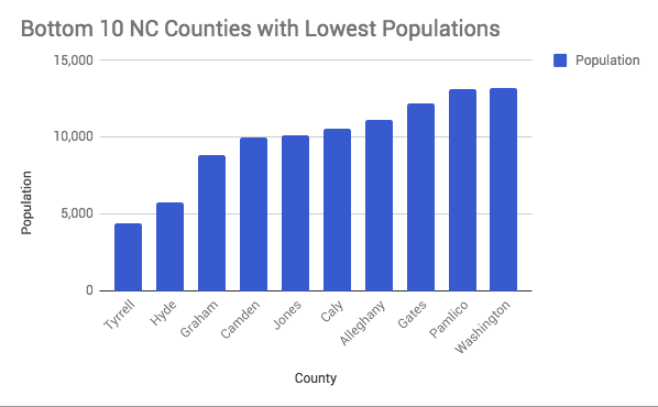
These bar charts detail the top 10 most and least populous counties in North Carolina. This data was created with the Wikipedia information used above. The graphs were attempted in R studio but due to a flaw in code we finished in Google Sheets. View my attempted code for the bottom 10 least populous counties:
top10_rank = count(d1416v6, county) %>% arrange(desc(n)) %>% head(10)
bottom10_rank = count(incomeByCounty, Population) %>% arrange(n) %>% head(10)
population2g = ggplot(bottom10_rank, aes(x=County, y=pop)) + geom_bar(stat="identity") + ggtitle("Bottom 10 Least Populous in NC") population2g
North Carolina Counties with the Highest and Lowest Incidents of Overdose Deaths
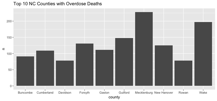

These bar charts detail counties in North Carolina with the highest and lowest incidence of drug overdose. This data was created with the Wikipedia information used above. View my code below:
top10_rank = count(d1416v6, county) %>% arrange(desc(n)) %>% head(10) g = ggplot(top10_rank, aes(x=county, y=n)) + geom_bar(stat="identity") + ggtitle("Top 10 NC Counties with Overdose Deaths") g
bottom10_rank = count(d1416v6, county) %>% arrange(n) %>% head(10) g = ggplot(bottom10_rank, aes(x=county, y=n)) + geom_bar(stat="identity") + ggtitle("Bottom 10 NC Counties with Overdose Deaths") g
Recent Overdose Snapshot
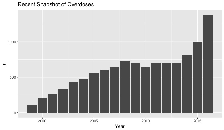
This graph gives a snapshot of recent overdose levels in North Carolina from 1999 to 2016. As shown in the graph, there has been a steady increase in overdose deaths since 1999. To begin this code, I cleaned the data in an excel sheet. I initially attempted to combine these rows using rbind but could not combine because of an error in the column names. View my code below:
years = read.csv("Year.csv") year = count(years, Year) %>% arrange(desc(n)) g = ggplot(year, aes(x=Year, y = n)) + geom_bar(stat="identity") + ggtitle("Recent Snapshot of Overdoses") g
Conclusions
My hypothesis that as income decreases, drug overdose deaths will also decrease proved to be true. However, this was not generally true in counties with large and diverse populations and socioeconomic statuses.
It can be assumed that these overdose deaths have been a result of the opioid crisis in America. Opioid abuse is unique in that it crosses all racial, economic, social, and geographical boundaries. This correlation is seen in my analysis of population and overdose deaths. When comparing the cities that both placed in the top 10 highest in population and number of overdose deaths, as well as top 10 lowest in population and number of overdose deaths, there is not a distinctive pattern.
As our access to drug overdose data is increasingly more availble, I would like to continue updating this analysis to better understand and examine the complex relationship between income, population, and overdose deaths in North Carolina. I also hope to fix the flawed code to present this in a cleaner manner in the future.