What Makes a Popular Song on Spotify?

Background
With 70 million subscribers and counting, Spotify is the world's largest music streaming service. I have had a Spotify account for many years. As a stingy college student, it's one of the few online subscriptions that I'm willing to pay a recurring fee for myself.
For this project, I wanted to look at the common features between popular songs on Spotify. Spotify's ability to suggest songs based on my previous plays is exceptional. The company uses various audio features to classify all of the complexities found in a song into universal categories, mainly for the purpose of predicting a user's tastes. Is there something that links popular music together? How likely are popular songs to be classified as happy or sad? Do artists with higher stream numbers on their songs have similar classifications on Spotify? I think that popular artists will have happier and more upbeat songs that will reflect in Spotify's audio categories.
The Most Streamed Songs of All Time
Along with its extensive song metrics, Spotify records the total amount of plays or streams that one track accumulates. Click here for the latest version of the most streamed songs on Spotify. This table organizes the most streamed songs on Spotify of all time. All of the Spotify numbers used in this report are accurate as of May 2, 2018.
To get a better sense of the distribution of songs over time on the Top 100 list, I graphed the frequency of songs per year.

2015-2017 are the only years with more than 20 songs on the list. However, this might be attributed to Spotify's ever-growing user base in the past few years. With 29 songs on the list, 2016 was the most popular year for Spotify songs. Classics like "Starboy" by The Weeknd and "Let Me Love You" by DJ Snake headline that year's overall success. Both songs have nearly a billion plays.
Which Individual Artists Have Multiple Songs on the Top 100 Most Streamed List?
Anyone can have a one-hit wonder, but which artists seem to have the special formula for creating hit tracks? The graph below shows artists with more than one song on the Top 100 Most Streamed List.
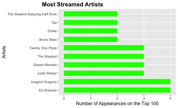
With five songs on the list, The Weeknd narrowly edges out Ed Sheeran and Imagine Dragons as the most common artist found on the list. The Weeknd found incredible success with his third studio album, "Starboy", which has two songs on the list featuring Daft Punk as well as three songs from his sophomore album, "Beauty Behind the Madness." Ed Sheeran, with four songs on the list, has the most streamed song of all time, "Shape of You."
How Does Spotify Classify Songs?
One of Spotify's most effective tools is its ability to recommend songs to its users based on previous choices. The company does this by classifying songs into different categories. Categories include: danceability, energy, key, valence, acousticness, instrumentalness, liveness and tempo. When a song fits a certain amount of criteria based on user feedback, a new song will appear on a customer's "discover weekly" playlist. To look at Spotify's explanations behind their metrics, click here.
Out of all of the categories on Spotify's API, I am most interested in valence, danceability, energy and speechiness. These are categories that directly refer to innate human emotions. In the context of songs that just about everyone knows, how alike are these categories with one another? First, I examined the correlation between valence and danceability.
Spotify uses the word “valence” to measure whether a song is likely to make someone feel happy (higher valence) or sad (lower valence). The metric is measured on a scale from 0.0 to 1.0. "Danceability" refers to how suitable a track is for dancing based on a combination of musical elements. A value of 0.0 is least danceable and 1.0 is most danceable.
In order to better understand the relationship between these two seemingly arbitrary measurements, I plotted a scatterplot that examines the correlation between the two variables. My prediction is that the two features will have a positive correlation with one another. Each dot belowrepresents a song by one of the artists with more than one song on the list.
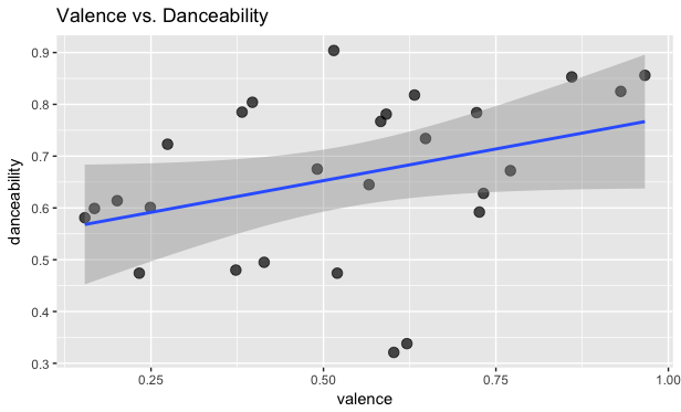
Other than a few outliers, valence and danceability appear to have a moderate, positive correlation with one another. As valence increases, so does danceability. The most "danceable" song on the top 100 list, according to Spotify, is Drake's "Hotline Bling", the highest dot on the graph above. Although "Hotline Bling" has a high danceability rate, it is middle-of-the-road in terms of valence. The happiest song in terms of valence are Shawn Mendes' "There's Nothing Holding Me Back", followed closely by "Shape of You" by Ed Sheeran. Both tracks have high danceability ratings as well.
Do Lyrics Take Away From a Song's Energy?
Next, I analyzed the relationship between the measures, "Speechiness" and "Energy." Speechiness detects the presence of spoken words in a track. The more words in a track, the closer the measure will be to 1.0. Less words will lead to a value closer to 0.0. It is also important to consider that since Spotify is home to audiobooks and podcasts as well, most songs lie between 0.1 and 0.4 range. Energy is a measure from 0.0 to 1.0 and represents a perceptual measure of intensity and activity. Typically, energetic tracks feel fast, loud, and noisy. A death heavy metal song will have a significantly higher energy level than a piece by Mozart.
I plotted another scatterplot below with the same rules. I think that these two audio features will have a negative correlation.
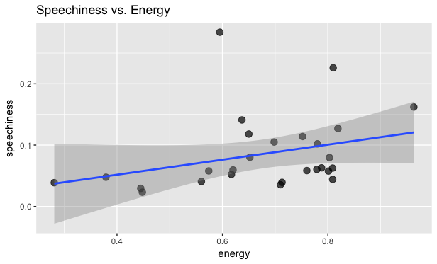
There seems to be a weaker, positive correlation between speechiness and energy. This means that in most cases, but not all, the amount of words on a track leads to a higher energy level in popular music. The most "speechy" songs on the consolidated list are "Starboy" by The Weeknd and "Treat You Better" by Shawn Mendes. Both songs have above average valence ratings as well. Ed Sheeran's "Perfect" and "Thinking Out Loud" have the lowest speechiness ratings on the list, as well as below average energy levels.
Categories Over Time
Now that we know how the features interact with one another, have any of them changed over time? In order to answer this question, I calculated the average of each metric and graphed each answer by year. Each graph is color-coated based on the correlation comparisons above.
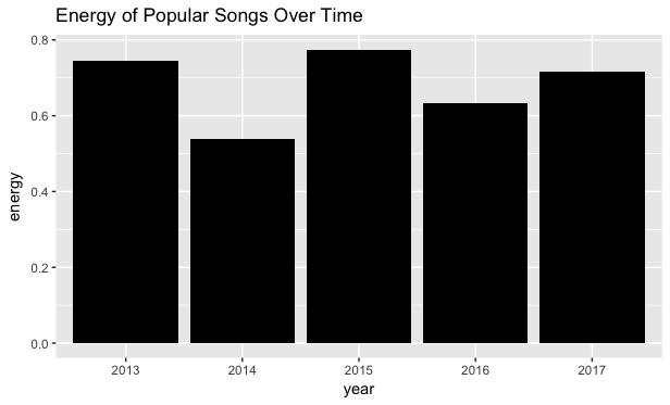
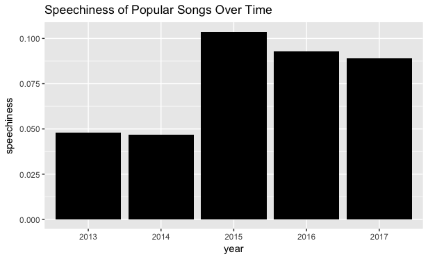
Although 2013 seems to have an inverse correlation between energy and speechiness, it should be noted that both songs on the list from that year are by The Imagine Dragons, a band known for their high energy instrumentals and not for their lyrical prowess. 2015, the highest year for both categories, has a diverse range of songs, from Shawn Mendes' "Stitches" to Major Lazer's "Light it Up". Overall, I was surprised to see that the speechiness of songs by popular artists has increased in the past few years.
Danceability and Valence Over Time
Next, I looked at the danceability and valence of popular songs over time. According to Spotify's records, the average valence and danceability of popular music over the past fifty years hovers around 0.5. It is also important to understand that with each passing year, the sample size of songs increases because there are more newer songs on the list than older ones.
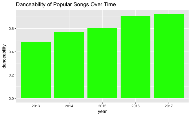
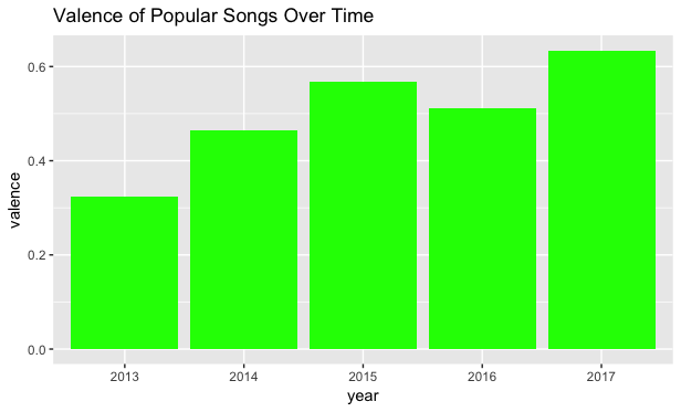
Both of these graphs reflect the correlation plots from the previous section. Valence and danceability increase in just about every year almost simultaneously. However, I was surprised to see that these popular songs' valence rates hover around the average of the past fifty years. Only the 2015 and 2017 averages are above the 0.5 threshold of a "happy" song. Danceabililty was also much higher than average in 2016 and 2017. This might be attributed to the fact that the top five most danceable songs on the list were published in 2016 and 2017. "Hotline Bling" and "Shape of You" have danceability ratings above 0.8 and are quite hard not to dance to.
Conclusion
Before I analyze my hypothesis, it should be noted that this study is a time capsule in Spotify's history. The list of the Top 100 Streamed Songs of All Time will change significantly in the future. My analysis is a relevant case study for the early years of Spotify's API, but it would be interesting to see if the averages and correlations remained the same as new songs appear on the list.
In conclusion, Spotify's most popular artists, for the most part, do have happier and more danceable songs than the average track. In terms of correlation, I was incorrect in thinking that speechiness takes away from energy, but accurate in my prediction that a happier sentiment (valence) is more likely to make a song easier to dance to (danceability).
It would be compelling for someone more musically adept than myself to investigate Spotify's musically oriented audio features such as "loudness", "tempo" and "key".