YouTube Trending Videos
By: Rachel Brown

Introduction:
YouTube is a social platform that hosts videos posted by the public. YouTube is owned by Google and over one billion videos have been published on the platform. It was invented in February of 2005 in San Mateo, California. YouTube has become such a big platform that now being a “YouTuber” is considered a job, YouTube pays channels who have videos getting a lot of traction or are trending. Many singers and performers started on YouTube including but not limited to: Justin Bieber, Liza Koshy, Shawn Mendes, Cody Simpson, and Susan Boyle. Stories of rags to riches like Justin Bieber and Liza Koshy has inspired a generation of artists and comics that want to try to “make it big” on YouTube and the world of entertainment.
Background: The data was sourced from Kaggle, and had all of the YouTube analytics for trending videos for 2017 and 2018. This data includes: trending date, title of video, channel title, publish time, tags, views, likes, dislikes, number of comments, and description. The way Youtube functions you do not have to like, dislike or comment on every video you watch. Trending videos are chosen daily by YouTube and are not determined by current view count. According to the YouTube help website, YouTube chooses videos that are: appealing to wide variety of viewers, do not involve clickbait, capture what’s happening in the world, the video is continuing to gain views daily, and looks into how long the video has been on YouTube.
Hypothesis: If the number of views on a video increases, then the engagement with the post (likes, dislikes and comments) also increases. I predict that there will be an almost even amount of likes to dislikes.
To start this process of creating visualizations I imported tidyverse, tidytext, dplyr, ggplot2, and my dataset CAvideos1.
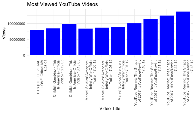
Most Viewed YouTube Videos: The visualization below shows the most viewed trending YouTube Videos. On the x axis you will find the videos titles and on the y axis you will find the view count for each. The x axis also includes the date the video was trending (year, day, month). Some of the videos were trending multiple days. For this reason the videos are shown multiple times on the visualization. To create this visualization I first had to “arrange” the data in order by views. I then used the function “head” so that I was able to just look at the top ten trending videos by views. As mentioned before some of the videos trended multiple days in a row so the original ggplot stacked the data in chunks over it’s title. That ggplot was hard to understand and made the data look like it was telling a completely different story. I used the function “paste” (which concatenates the two items and specifies a separating element). Using this function “CAviews3$title_date <- paste(CAviews3$title, CAviews3$trending_date)” it allowed me to no longer have a stacked bar graph but rather ten separate bars of each of the ten videos that were trending and had the highest views. CAviews3$trending_date linked the views column and the trending date column. That is why the video title for each video includes the trending date.
Code:
arrange(CAvideos1,desc(views)) -> CAviews2 View(CAviews2) CAviews2 %>% head(10) -> CAviews3 view(CAviews3) str(CAviews3$views) CAviews3$title_date <- paste(CAviews3$title, CAviews3$trending_date) ggplot(CAviews3, aes(x=title_date, y=views), las=2) + geom_col(fill = "blue", color="white") + scale_x_discrete(labels = function(x) str_wrap(x, width = 25)) + ggtitle("Most Viewed YouTube Videos") + theme(axis.text.x = element_text(angle = 90, hjust =1)) + labs(x="Video Title", y="Views")
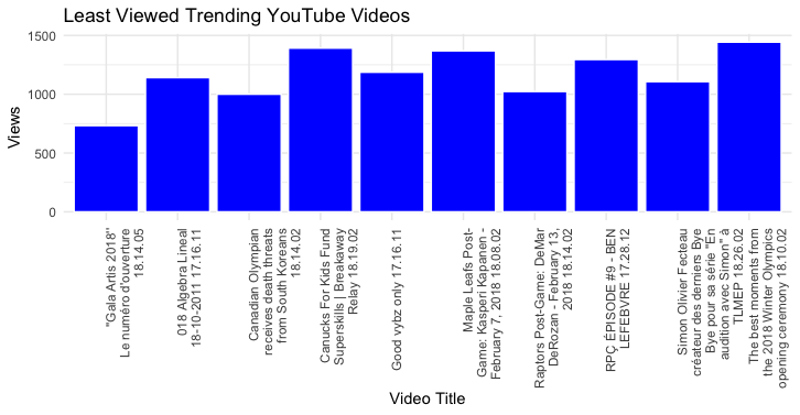
Least Viewed Trending Youtube Videos: For this visualization I looked into the videos that made the trending list even though they had significantly less views in comparison to other videos that consistently made the trending list day after day. This data goes to show that being selected by YouTube as “trending” does not automatically mean you have thousands of views. In order to create this visualization I used the same process as I did for, the most viewed YouTube videos but used the function “tail”. Then since the titles Video Titles were so long I wrapped the text using “str_wrap” and put them on a 90 degree angle using, “element_text(angle = 90, hjust =1))”.
Code: arrange(CAvideos1,desc(views)) -> CAviews2
View(CAviews2)
CAviews2 %>% tail(10) -> leastview
view(leastview)
str(leastview$views)
leastview$title_date <- paste(leastview$title, leastview$trending_date)
ggplot(leastview, aes(x=title_date, y=views), las=2) + geom_col(fill = "blue", color="white") +
scale_x_discrete(labels = function(x) str_wrap(x, width = 25)) +
ggtitle("Least Viewed Trending YouTube Videos") +
theme(axis.text.x = element_text(angle = 90, hjust =1)) + labs(x="Video Title", y="Views")
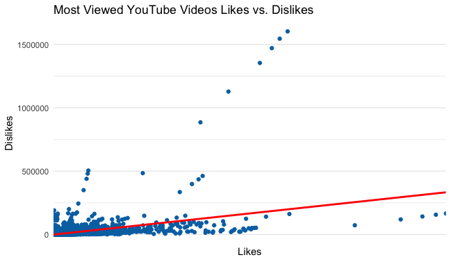
Most Viewed Youtube Videos Likes vs. Dislikes:
This visualization plotted each of the videos in their relationship to their likes and dislikes. The red line is a regression line. Since the regression line is going upward that means there is a positive slope. A positive slope means there is a positive relationship between likes and dislikes. To create this visualization I first had to use the function “arrange” to put the data in order of views, with the highest viewed trending videos at the top. I then plotted the data in the CAviews2, using the like and dislikes column. For this graph I used a geom point graph. This form of graph was chosen because it would plot the data in relation to each individual videos likes and dislikes. I then added a regression line. The regression line is used to show the slope of the graph. The regression line was created using the function “geom_smooth”. After this I titled the graph and ran the code.
Code:
arrange(CAvideos1,desc(views)) -> CAviews2 View(CAviews2) str(CAviews2$views) ggplot(CAviews2, aes(x=likes, y=dislikes)) + geom_point(color=primary) + geom_smooth(method = "lm", color="red") + scale_x_discrete(labels = function(x) str_wrap(x, width = 12)) + ggtitle("Most Viewed YouTube Videos Likes vs. Dislikes")
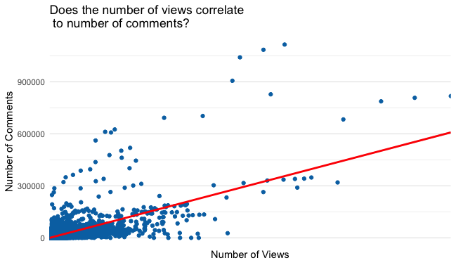
Does the number views correlate to number of comments? : This visualization shows a positive regression line. The comments are represented on the y axis and the x axis represents the number of views. There is a positive regression which indicates that there is a positive relationship between dislikes and likes on trending videos. I used the same functions to code the regression line, “geom_smooth”.
Code:
arrange(CAvideos1,desc(views)) -> CAviews2 View(CAviews2) str(CAviews2$views) ggplot(CAviews2, aes(x=views, y=comment_count)) + geom_point(color=primary) + geom_smooth(method = "lm", color="red") + scale_x_discrete(labels = function(x) str_wrap(x, width = 12)) + ggtitle("Does the number of views correlate\n to number of comments?") + xlab("Number of Views") +ylab ("Number of Comments")
Least Viewed Trending Youtube Videos Views vs. Likes: This visualization took the information in the “tail” of trending videos by views one step further. This allowed me to look at the number of views the videos were getting in reference to the number of likes the video is receiving. It is interesting to see that some of the videos that did not get many views received more likes than their counterparts.
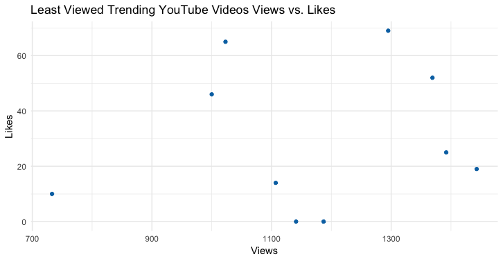
Code:
#least viewed trending likes arrange(CAvideos1,desc(views)) -> CAviews2 View(CAviews2) CAviews2 %>% tail(10) -> leastview view(leastview) str(leastview$views) leastview$title_date <- paste(leastview$title, leastview$trending_date) ggplot(leastview, aes(x=views, y=likes)) + geom_point(color=primary) + ggtitle("Least Viewed Trending YouTube Videos Views vs. Likes") + xlab ("Views") + ylab ("Likes")
Least Viewed Trending Youtube Videos Views vs. Comments: This visualization was created in the same manner as the one prior. The difference with this one though is that I substituted likes for comments. This visualization shows that there is not much of a difference between the amount of likes or comments a video received when it is trending with very little views.
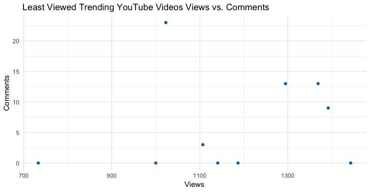
Code:
#least viewed trending comments arrange(CAvideos1,desc(views)) -> CAviews2 View(CAviews2) CAviews2 %>% tail(10) -> leastview view(leastview) str(leastview$views) leastview$title_date <- paste(leastview$title, leastview$trending_date) ggplot(leastview, aes(x=views, y=comment_count)) + geom_point(color=primary) + ggtitle("Least Viewed Trending YouTube Videos Views vs. Comments") + xlab ("Views") + ylab ("Comments")
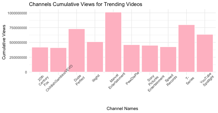
Channels Cumulative Views for Trending Videos: For this visualization I used my top channel data filter set. This data has the top ten channels based on which channels had the most cumulative views of all trending videos. So an example is: if a channel had five trending videos all of those views were added together. I then labeled both axis and gave the graph a title.
List of Top Channels:
1. Marvel Entertainment - 1011420205
2. T-Series - 799114025
3. Dude Perfect - 729916338
4. Youtube Spotlight - 635976769
5. Ibighit - 635976769
6. PewDiePie - 461700524
7. Sony Pictures Entertainment - 451188760
8. Speed Records - 426604974
9. 20th Century Fox - 419577035
10. ChildishGambinoVEVO - 411775069
Code:
ggplot(channeldesc, aes(x=channels, y=x)) + geom_col(fill = "pink", color="white",color=primary) + scale_x_discrete(labels = function(x) str_wrap(x, width = -100)) + ggtitle("Channels Cumulative Views for Trending Videos") + xlab("Channel Names") +ylab ("Cumulative Views")
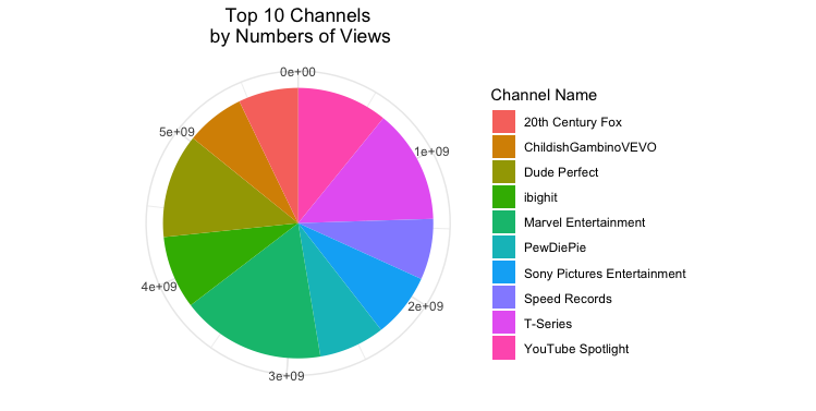
Top 10 Channels by Numbers of Views: This visualization is a pie chart of the top 10 YouTube channels. The reason these ten channels are the top is because they have the highest cumulative views according to the trending list analytics. The code that was used sorted the unique channel names and then added up the cumulative total views for each of them. In order to understand how to code this data I used to main sources, plotly and tutorials point. The first step called for me to determine which columns I did not want included in the chart, “[ -c(1:3,5:7,12:16)]”. Next I needed to define the input parameter by using the function “aggregate.” After that I followed the normal ggplot process but used the tutorials from the sources to get the visualization to appear the way I wanted. I chose to display this visulization in exponents because not doing so caused some of the numbers to be cut off the pie chart.
Code:DT <- CAvideos1[ -c(1:3,5:7,12:16)] DT$channel_title <- as.factor(DT$channel_title) DT <- aggregate(DT$views, by = list(channels = DT$channel_title), FUN = sum) arrange(DT,desc(x)) -> channeldesc View(channeldesc) channeldesc %>% head(10) -> channeldesc pie <-ggplot(channeldesc,aes(x="", y= x, fill=factor(channels))) + geom_bar(width = 1, stat = "identity") + theme(axis.line = element_blank(), plot.title = element_text(hjust=0.5)) + labs(fill="Channel Name", x=NULL, y=NULL, title="Top 10 Channels\n by Numbers of Views") pie + coord_polar(theta = "y", start=0)
Analysis: From the visualizations I created I can infer that a video does not need to have millions or thousands of views in order to be classified by YouTube as “trending”. One of the videos on the trending list only had 700 cumulative views. Some of the videos that were classified as trending had very little to no engagement with the content, while others had significant engagement. The more views a video received the more engagement that happened with the post (likes, comments, dislikes).
Conclusion: The more views a trending video received the greater consumer engagement that occurs. After analyzing the visualizations and looking at the regression line I came to the conclusion that there is a positive relationship between views and engagement (likes, dislikes, and comments). The likely reasoning behind the increased engagement is that more viewers watching a video means more people with the potential of joining the conversation.
Going Further: If this project were to be analyzed further it would be interesting to look categorize all of the videos and see how many of them have commonalities. Meaning how many of the videos are music related, movie trailers, prank videos, self help videos and more. Another observation that I noticed about this dataset is that multiple different channels had the same video, this means that the video was first published on one channel and then another channel reposted the content. It would be interesting to look at what types of videos get published on other channels and the differences in views.