3 Magical Examples of How Contrast Improves Typographic Design

The seven principles of typographic design, according to Carl Dair, are as follows: size, weight, form, structure, texture, color and direction. Dair’s 7 typographic principles display different kinds of visual contrast and make meaning stand out.
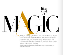
For example, this spread from JAN magazine uses size, color, form, structure and direction. All of these contrasts work together to make a headline and deck that is eye-catching to the reader. The layout puts extra emphasis on "magic." The large, cheerful "A" weaves in and out of the M and G, exemplifying the word it describes. The structure contrast between the headline and the deck pairs well together and encourages viewers to keep reading.


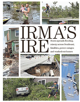
Irma’s Ire. It rolls right off the tongue with its alliterative heading and leaves no doubt to the destruction that Hurricane Irma caused. This article takes into consideration the contrast of size, weight and form. This article is concise in its delivery with clean lines and geometric monopolization of space, which leaves viewers with a clear understanding of the message.
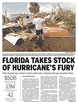
The article ‘Florida Takes Stock of Hurricane’s Fury’ definitely takes advantage of size and weight contrast. You can see the difference in size between the headline and the body copy, and the difference in weight between the statistics and the headline. The differences in weight and size draw the reader’s eye. It makes an impact, much like the hurricane that the article is describing.
Without employing Dair's 7 typographic contrast in design work, the text remains lifeless, illegible blocks on a page. Consciously thinking about how type can contrast with other elements on the pages is the best way to ensure your designs are clear, concise and legible to your audience.